Gini Coefficients and the Olympic Medal Race
Today’s post will attempt to answer a provocative question: is the race for Olympic medal dominance getting more competitive? In the process of addressing this topic, we’ll learn how to directly import data from WolframAlpha into Mathematica.
If you watched any of the Olympics over the past two weeks, you likely became familiar with the medal count table. This table is a grossly reductionist metric of national achievement at the Olympics. Nonetheless, it provides a useful way to quantify the aggregate performance of different nations.
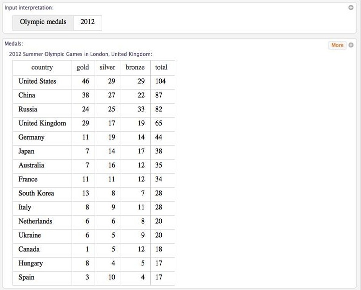
The United States took home 104 medals from the 2012 games, placing it at the top of the medal table. The race for the most medals was exciting, though, as China and Russia were not far behind.
Competitive balance among nations generates excitement. Parity is what makes things interesting. If one nation dominated the podium, the Olympics would be boring.
Is the competitive balance between nations improving or declining? One way to address this question is to look at the distribution of medals won by different nations. When most of the medals are won by a very few nations, competitive balance is poor; when medals are distributed more equally among nations, competitive balance is stronger.
The Gini coefficient is a statistic widely used by economists to measure income inequality. The Gini coefficient is proportional to the average difference between individual incomes in a population, normalized to fall between 0 and 1. A Gini coefficient of 0 indicates total equality; a Gini coefficient of 1 indicates all income is controlled by a single individual. We can use the same statistic to quantify inequality in Olympic medal winnings.
First, however, we need to find data on Olympic medals. This is particularly easy in Mathematica 8, due to its interface with WolframAlpha. For the uninitiated, WolframAlpha is a bit like a search engine. Rather than direct you to relevant webpages, though, it attempts to answer you query with data. If you type in a math problem, it will try to solve it. If you type in a request for data, it will display the results in a table.
You needn’t visit the WolframAlpha website to do a search. Instead, you can access it directly in Mathematica by typing WolframAlpha[“search item”]. For example, typing WolframAlpha[“2012 Olympic Medals”] yields the following output:

Clicking the more button in the upper right corner will expand the results to include all nations that won medals. The format of the output is the same pod format that you’ll see on WolfrmaAlpha’s website. To actually make use of the data, hit the plus symbol in the upper right corner and choose computable data. You can save the result as something like medals2012.
medals2012 = WolframAlpha\["summer olympic medals 2012",
             {{"OlympicMedalistResults:OlympicData",1},"ComputableData"},PodStates->{"OlympicMedalistResults:OlympicData\_\_More","OlympicMedalistResults:OlympicData\_\_More","OlympicMedalistResults:OlympicData\_\_More","OlympicMedalistResults:OlympicData\_\_More","OlympicMedalistResults:OlympicData\_\_More","OlympicMedalistResults:OlympicData\_\_More"}\]
We can repeat this process for other Olympics.
years = Complement\[Table\[1896 + 4\*j, {j, 0, 29}\], {1916, 1940, 1944}\];medals = Table\[
Drop\[WolframAlpha\[
StringJoin\["summer olympic medals",
ToString\[ k\]\], {{"OlympicMedalistResults:OlympicData", 1},
"ComputableData"},
PodStates -> {"OlympicMedalistResults:OlympicData\_\_More",
"OlympicMedalistResults:OlympicData\_\_More",
"OlympicMedalistResults:OlympicData\_\_More",
"OlympicMedalistResults:OlympicData\_\_More",
"OlympicMedalistResults:OlympicData\_\_More",
"OlympicMedalistResults:OlympicData\_\_More"}\], 1\]\[\[All, -1\]\], {k,
years}\]The ability to access WolframAlpha is pretty cool. You can get up to the second information on stock prices and weather, all without having to open a web browser.
Now that we have data, we can plot histograms for each Olympic year. Most of it is just formatting, but note that making flags is easy because they are part of Mathematica’s “CountryData” database.
flagbar2\[list\_\] :=
 GraphicsGrid\[
 Transpose\[{Map\[
 ImageResize\[
 ImageRotate\[ImageResize\[CountryData\[#, "Flag"\], {128, 85}\]\], {85,
 128}\] &, Map\[ToString\[#\] &, list\]\]}\], ItemAspectRatio -> 128/85,
 Spacings -> 0\]
 pick\[k\_\] :=
 Select\[(Union /@
 Map\[Flatten,
 Gather\[medals2012\[\[2 ;;, {1, 5}\]\], Part\[#1, 2\] == Part\[#2, 2\] &\],
 2\]), #\[\[1\]\] == k &\]
 pick1\[k\_\] := If\[Length\[pick\[k\]\] > 0, pick\[k\]\[\[1, 2 ;;\]\], 0\]
 flagbar3\[k\_\] := If\[pick1\[k\] === 0, Graphics\[Disk\[\]\], flagbar2\[pick1\[k\]\]\]
BarChart\[HistogramList\[medals2012\[\[2 ;;, -1\]\], {1}\]\[\[2\]\]\[\[2 ;;\]\],
ChartElements -> Table\[{flagbar3\[j\], {1, All}}, {j, 1, 105}\],
PlotRange -> {{2, 105}, {0, 18}},
FrameLabel -> {Style\["Total Medals", Medium, Bold\],
Style\["Frequency", Medium, Bold\]}, Frame -> True,
FrameTicks -> {False, True, False, False},
ChartLabels ->
Placed\[Rotate\[Style\[ToString\[# + 1\], Bold, FontSize -> 8\], Pi/2.5\] & /@
HistogramList\[medals2012\[\[2 ;;, -1\]\]\[\[1 ;; -1\]\], {1}\]\[\[1\]\], Below\],
Background -> LightGray, GridLines -> None, BarSpacing -> None,
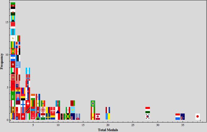
AspectRatio -> .2\]Here is the 2012 medal distribution (Right click to open image in a new tab for a better look):

BarChart\[HistogramList\[Drop\[medals2012\[\[2 ;;, -1\]\], 5\], {1}\]\[\[2\]\]\[\[2 ;;\]\],
 PlotRange -> {{1, 39}, {0, 18}},
 FrameLabel -> {Style\["Total Medals", Medium, Bold\],
  Style\["Frequency", Medium, Bold\]}, Frame -> True,
 FrameTicks -> {True, True, False, False},
 ChartElements -> Table\[{flagbar3\[j\], {1, All}}, {j, 1, 39}\],
 Background -> LightGray, GridLines -> None, BarSpacing -> None\]
Now we turn to the Gini Coefficient to see how medal inequality changes over the years. (Relax math folks; I mean inequality in the economic sense).
Below is the code for calculating Gini coefficients. Note the use of the command “Empirical Distribution”. This is another new feature in Mathematica 8. Given a data set, it generates the probability distribution, allowing you to directly use the associated probability density function and cumulative distribution function.
gini\[list\_\] :=
 Module\[{d}, d = EmpiricalDistribution\[list\];
 1 - Sum\[(
 PDF\[d,
 y\]\*(Sum\[PDF\[d, x\]\*x, {x, 0, y - 1}\] + Sum\[PDF\[d, x\]\*x, {x, 0, y}\]))/
 Sum\[PDF\[d, x\]\*x, {x, 1, Max\[list\]}\], {y, 1, Max\[list\]}\] // N\]
 ginis = Map\[gini\[#\] &, medals\];
A couple caveats are in order. First, we are only considering the distribution of medals among medal winning nations. Many nations attend the Olympics symbolically, but are not in serious medal contention. These are not included in this calculation. Furthermore, we only consider the total medal count, and hence golds, silvers, and bronzes are treated as equal achievements, which they are obviously are not.
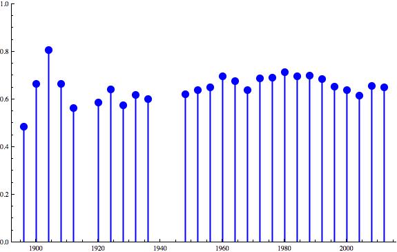
We can plot how the Gini Coefficient has changed over the years:
plotdata = Transpose\[{years, ginis}\];
 ListPlot\[plotdata, Filling -> Axis, PlotRange -> {{1892, 2016}, {0, 1}},
 AxesOrigin -> {1892, 0}, PlotStyle -> Directive\[Blue, PointSize\[0.02\]\],
 FillingStyle -> Directive\[Blue, Thick\], Frame -> True\]
Remember, lower Gini Coefficients mean better competitive balance. What do you make of these results?
Here are some geopolitical questions to ponder:
- Why the peak in inequality in 1980?
- Why the decrease starting in 1992?
- Why have 2008 and 2012 been less equal than the recent past?
